---
title: "Controls"
description: "object table controls allow the user to interact with the table and its data. They include a search box and pagination controls. They will display at the bottom of an object table by default, but can also be hidden or positioned at the top and/or bottom."
permalink: /docs/build/ui-components/all-ui-components/object-table/object-table-guides/controls/
---
# Controls
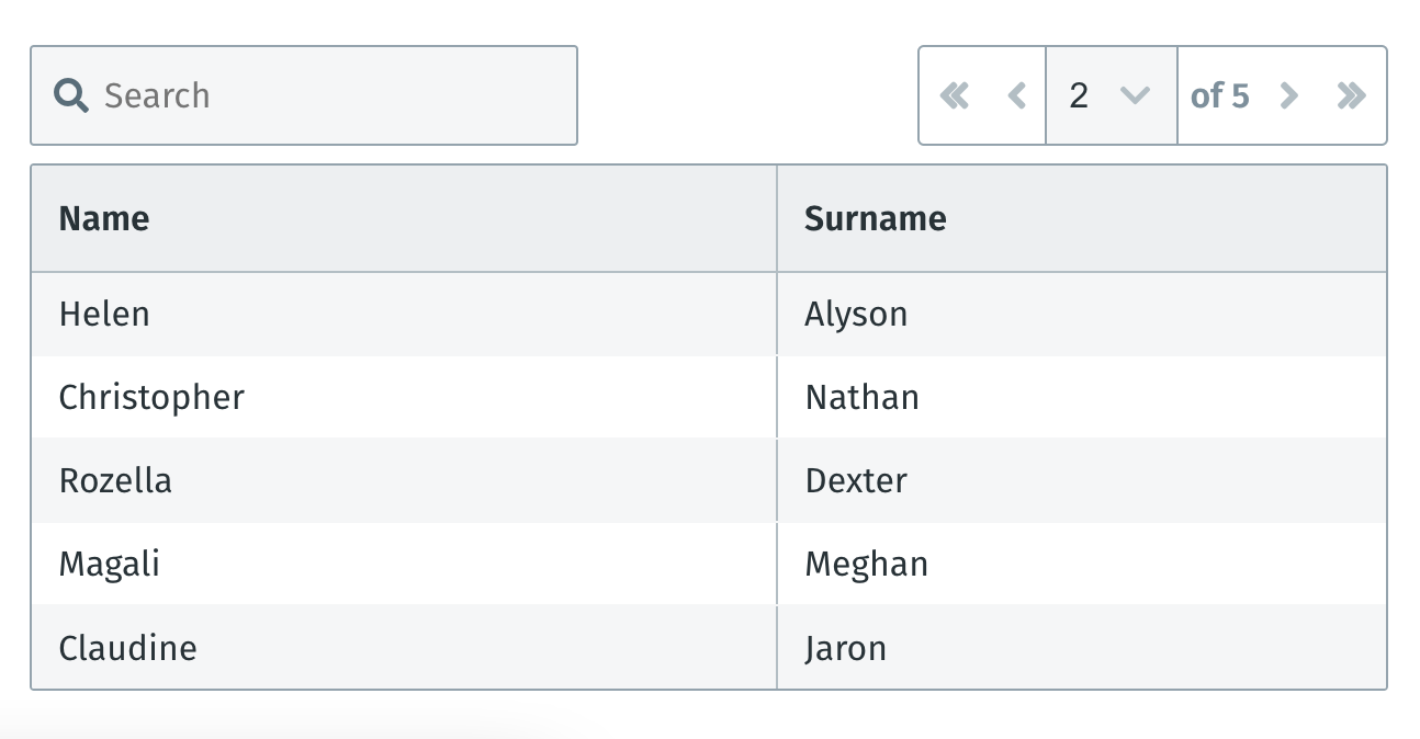
`object-table` [`controls`](/docs/build/ui-components/all-ui-components/#controls) allow the user to interact with the table and its data. They include a search box and pagination controls. They will display at the bottom of an `object-table` by default, but can also be hidden or positioned at the top and/or bottom.
#### Positioning
| Parameter | Description | Example |
| --------- | ------------------------------------------------------- | ------------------- |
| `top` | Positions table controls at the top of the table | `controls="top"` |
| `both` | Positions table controls at top AND bottom of the table | `contols="both"` |
| `bottom` | Positions controls at the bottom of the table | `controls="bottom"` |
| `none` | No controls | `controls="none"` |
#### Example: `controls` positioned at the `top`
The `top` position is useful if the height of the table will be changing drastically due to large amounts of non-deterministic content. Placing the controls at the top prevents the buttons from constantly moving up and down when pages are changed.
```xml
...
```
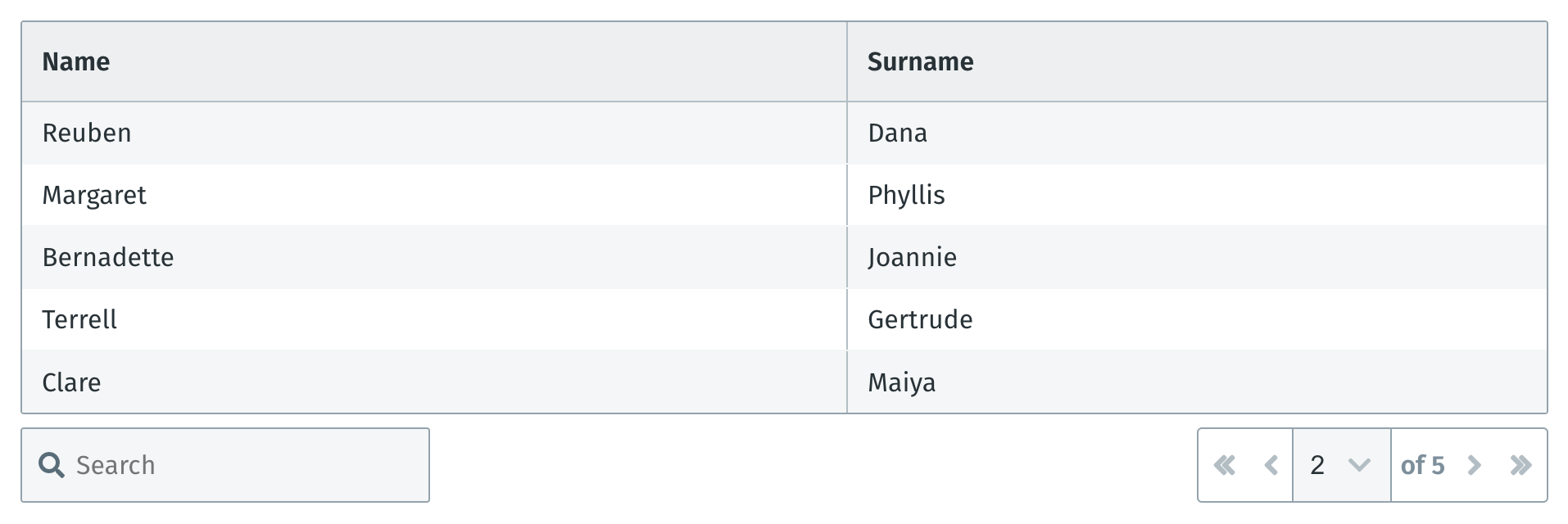
#### Example: `controls` positioned at `both` (top and bottom)
```xml
...
```

#### Example: `controls` positioned at the `bottom`
```xml
...
```
#### Example: `controls` positioned at `none` (no controls)
**Tip**: It is advised to set a larger [limit](/docs/build/ui-components/all-ui-components/#limit), for visibility, when controls are hidden.
```xml
...
```

When controls are set to `none` and the number of entries exceeds the `object-table` `limit`, a "Show more" button will appear.
### Sticky headers and footers
When an `object-table` has sticky headers and/or footers along with `mode="paginate"`, the controls will also be present in the corresponding sticky header or footer.
### Action buttons
Action buttons appear in the controls. The purpose of these buttons are to provide table actions that should in most cases, apply to the table itself.

Since space inside table controls are limited, the buttons employ a best fit algorithm to expand or collapse based on the available space in the render area.
#### Standard syntax
Action buttons follow the same syntax as [`button-group`](/docs/build/ui-components/all-ui-components/button-group/).
```xml
...
...
```
**Exposing data**
Since action buttons will mostly be used by engineers to apply batch operations to the data, a few variables are exposed to the `on-press` function:
| parameter | description | example |
| ------------------- | -------------------------------------------------------------------------------------------------- | ------------------------------------------------------- |
| $filteredData | All table data, this also contains all the hidden column data | `{columns: ['C', 'D'], rows: [{ A: '...', B: '...' }]}` |
| filteredDisplayData | Exactly the same as `$filteredData` but only contains the visible data due to the table pagination | `{columns: ['C', 'D'], rows: [{ A: '...', B: '...' }]}` |
| controls | The state of the table based on the current controls | `{ page: 1, totalPages: 1, limit: 19, filters: {} }` |
**Split buttons**
In cases where the engineer wants to force the first button to be visible but collapse the rest `mode="split"` can be used on the button-group.
```xml
...
```

**Scrollable table**
When a scrollable table is used instead of a paginated table, the action buttons are still present even without the rest of the controls:
